Posts

Showing posts with the label #Buy Limit

Bearish Counter-Attack Candlestick Pattern

Image
What are bearish  counterattack lines? The Counterattack Lines Pattern is a two-candle reversal pattern that appears on candlestick charts. This can happen during an uptrend or downtrend. In a bullish reversal during a downtrend, the first candle is a long black candle (low) and the second candle pulls away but then closes higher near the close of the first candle. This shows that sellers were in control, but could lose control as buyers could fill the void. In a bear reversal during an uptrend, the first candle is a long white (rising) candle and the second candle goes up but then closes lower near the close of the first candle. Counterattack candlestick pattern: an example Understanding the model and what it means becomes much easier when you see it in action. So let's take a look. This is what the bullish counterattack pattern looks like. Take a moment to look at this figure. The bearish candlestick is black while the bullish candlestick is white. Here you can see that prices ar...

Bearish Counter-Attack Candlestick Pattern

Image
  Bearish Counter-Attack Candlestick Pattern The bearish counterattack candlestick pattern is a bearish reversal candlestick pattern. A bearish counterattack candlestick pattern can lead to a quick price reversal to the downside. An uptrend has been underway for some time, and bullish investors are comfortable with the momentum in the stock price. A bearish counterattack candlestick pattern starts with too much of the same, maybe even too much of an anniversary, as price opens with a gap from the close of the previous candlestick pattern. Bullish investors feel good about the gap this morning. But somewhere in the middle of the trading period, things change. Investors sell shares, and at the end of the trading period, the closing price of the candle is equal to or even slightly lower than the closing price of the previous candle. Hence the naming convention "counterattack".     How to Use the Counterattack Candlestick Pattern?   Recognizing the pattern is one thing. ...

The Neck Candlestick Pattern

Image
What is in The Neck Candlestick Pattern? The pattern at the neckline occurs when a long real-body bearish candle is followed by a smaller real-body rising candle that widens at the open but then closes near the close of the previous candle. The pattern is called a cleavage because the two closes are the same (or nearly the same) on both candles, forming a horizontal cleavage. In theory, the pattern is considered a continuation pattern, which indicates that the price will continue to fall following the pattern. In reality, this only happens half the time. As such, the pattern often suggests at least a short-term bullish reversal. What Does the Neckline Candlestick Pattern tell Traders? The candlestick pattern at the neckline informs traders of the possibility of the current trend in the market continuing. If the study is exhaustive, it also sheds light on the general behavior of the market in which it occurs. The appearance of the first bearish candle indicates the strength of the bears...

What is a Marubozu candlestick pattern?

Image
What is a Marubozu candlestick pattern? A Marubozu candlestick pattern is a stock chart pattern that can help investors gain insight into market sentiment at any time. Although Marubozu's model performs quite well when spotted, it remains relatively unpopular with investors. We take a look at the basics and key features of the model so you can start harnessing the power of this little-known stock market predictor. Marubozus are full-bodied bullish or bearish candlesticks with no upper wicks or lower shadows. Marubozus are usually green or white when they are bullish and red or black when they are bearish on stock charts. What are the pros and cons of using the Marubozu candlestick pattern? An important point to keep in mind when researching Marubozu candles is that while you should never trade in the same direction as the candles, you should definitely trade against them. Given the trading activity that is driving this pattern, if the market continues to move in this direction, you...

Three White Soldiers

Image
  Three White Soldiers Definition The Three White Soldiers candlestick pattern is unusual in that its meaning depends on its context. However, the pattern itself is easy to spot. This training is simply three days in a row with a white candle, each higher than the last. The apparition is of three white soldiers standing in a row, hence the name. The bullish significance of this formation is easy to guess. But how reliable is this indicator?   This indicator is quite strong and very reliable in most situations, indicating an accumulation of bullish strength. For example, when a market is flat or moving mostly sideways, the three white soldiers indicate that the bulls are gaining ground. When the market has entered a downtrend, this candlestick pattern indicates a reversal. However, when the market is constantly progressing, the three white soldiers are considered less important. That's because they fit the current blueprint and aren't even really considered a sequel.   How...

Morning Star

Image
 The Morning Star For the sake of simplicity, a bearish candlestick is one in which the stock's closing price is lower than its opening price, meaning that the price has fallen during the day. In contrast, a bullish candlestick is one where the closing price is higher than the opening price because the price has risen throughout the day. With that in mind, let us know as we take a closer look at the construction and key features of this popular candlestick pattern. What is the difference between Morning Star and Evening Star candlestick patterns? The main difference between the Morning Star and Evening Star candlestick patterns is that the Morning Star is considered a bullish indicator, while the Evening Star is considered a bearish indicator. The Evening Star has the center candle at a higher high than the two side candles with a gap up followed by a gap down, while the Morning Star has the center candle at its highest low with a gap down followed by a gap up. An example of a morn...

Bullish Engulfing Pattern.

Image
  What is a Bullish Engulfing Pattern? A bullish engulfing pattern is a white candlestick that closes above the previous day's open after opening below the previous day's close. It can be recognized when a small black candlestick indicating a downtrend is followed the next day by a large white candlestick indicating an uptrend, the body of which completely covers or engulfs the body of the previous day's candlestick. A bullish engulfing pattern can be contrasted with a bearish engulfing pattern. With a single candlestick pattern, the trader only needed one candlestick to spot a trading opportunity. However, when analyzing multiple candlestick patterns, the trader needs 2 or sometimes 3 candlesticks to identify a trading opportunity. This means that the trading opportunity develops for at least 2 trading sessions. What Is a Bullish Engulfing Pattern? To find bullish engulfing patterns, look for these two candlesticks side by side: A small red candlestick, usually at the end ...

What is the relationship between PPO and MACD?

Image
What is the relationship between PPO and MACD? The PPO is almost identical to the moving average convergence divergence (MACD) technical indicator. Both are momentum oscillators, which measure the difference between the two moving averages. However, there are differences between the two listed below: Difference between the two, PPO and MACD Here, the PPO measures the percentage difference between the two EMAs, while the MACD measures the absolute difference (in dollars). MACD(12,26,9) calculated the absolute difference between the 12-day and 26-day EMA. On the other hand, PPO(12,26,9) MACD goes a step further by showing the percentage difference between these two MAs. Percentage Price Oscillator (PPO) Formula and Calculation Use the following formula to calculate the relationship between two moving averages for a holding. PPO=  26-period EMA 12-period EMA−26-period EMA ​ ×100 Signal Line=9-period EMA of PPO PPO Histogram=PPO−Signal Line where: EMA=Exponential moving average ​Use wi...

Accumulation Distribution Indicator

Image
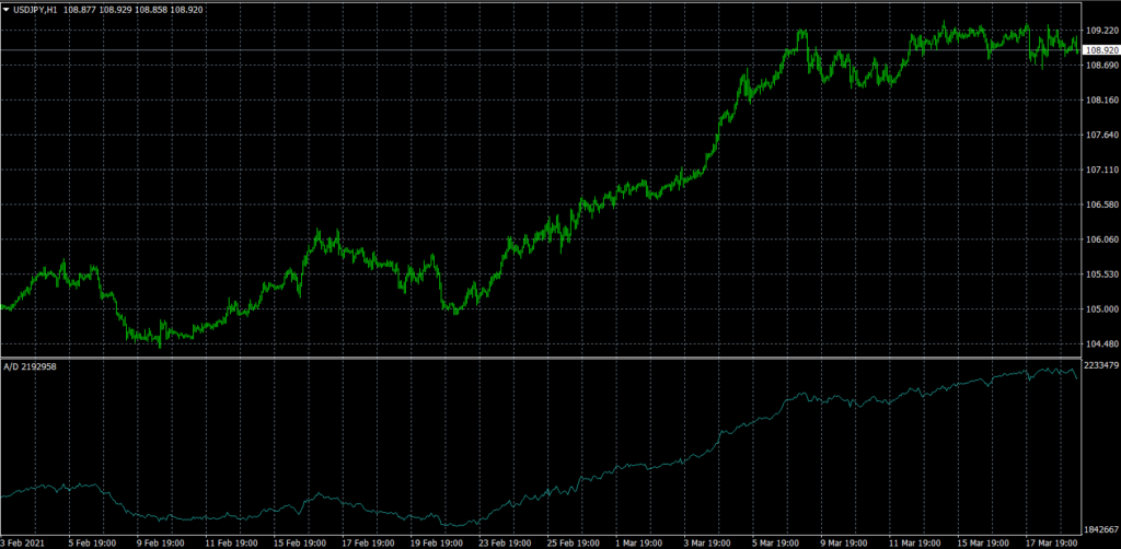
  What Is the Accumulation Distribution Indicator? The A / D metric attempts to identify discrepancies between stock price and volume flow. This gives an indication of the strength of a trend. If the price rises but the indicator falls, it suggests that the volume of purchase or accumulation may not be enough to support the rise and that a fall in price may be imminent. This is how this indicator works 1The actual value of the accumulation distribution is not important. Focus on your direction. 2If the price and the accumulation distribution reach higher highs and lows, the uptrend should continue. 3If the price and the distribution of the accumulation reach lower highs and lows, the downtrend should continue. 4If the accumulation distribution increases in a trading range, accumulation can occur and is a warning of a breakout to the upside. 5If the accumulation distribution falls during a trading range, a distribution can occur and is a warning of a breakout to the downside. The ac...

The Aroon Indicator

Image
 Definition and Use of the Aroon Indicator The Aroon indicator was developed by Tushar Chanda in 1995. Tushar chose this name because the indicators are supposed to reveal the start of a new trend. The Aroon indicator is similar to other momentum oscillators in terms of when the market enters a trend. It becomes more effective in confirming signals or conditions identified by additional technical analysis. Calculation of Aroon Indicators Calculating Aroon metrics is not as complicated as you might think. It simply requires that the high and low prices of an asset be tracked for the number of periods used in the formula. As mentioned above, almost all of the 25 periods of use are recommended by Tushar Chande. Track the ups and downs in the asset price over the last 25 time periods. Note how long it has been since the last high and low. Use these numbers in the Aroon-Up and Aroon-Down formulas below. Aroon-Up = ((25 days from 25-day max) / 25) x 100 Aroon-Down = ((25 days from 25-day...

Elliott Wave Theory

Image
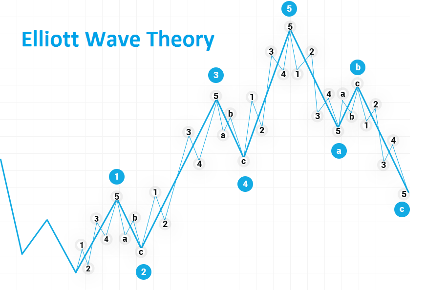
Introduction to Elliott Wave Theory Ralph Nelson Elliott developed Elliott Wave Theory in the 1930s.1 Elliott believed that stock markets, which are generally considered more random and chaotic, were in fact traded in repeating patterns. In this article, we take a look at the history of Elliott's wave theory and its application to trading. WAVES Elliott has suggested that financial price trends system on the psychology of the dominant investor. He found that fluctuations in mass psychology always manifested in the same recurring or "vague" fractal patterns in financial markets. Elliott's theory is similar to Dow's theory in that they both recognize that stock prices move in waves. But because Elliott also recognized the "fractal" nature of markets, he was able to break them down and analyze them in much more detail. Fractals are mathematical structures that repeat themselves over and over on a smaller and smaller scale. Elliott found that stock index pri...