Posts

Showing posts with the label BollingerBands

Rising Three Methods

Image
  Rising Three Methods Bullish Rising Three Methods is a trend continuation pattern that alerts traders to a weakening in the current trend. The long white candle of the first day is followed by three shorter descending candles. The smaller candles reflect trend resistance, which may include a trend reversal. These 3 candlesticks are usually black and part of their body remains within the price action range of the first day. The formation ends on the fifth day with another white candle. The opening price of this candle is higher than the closing price of the first day. The uptrend should continue. The three-way pattern is a trend continuation pattern that can occur in an uptrend or downtrend. In an uptrend it is called a three-way ascending pattern and in a downtrend it is called a three-way descending pattern. The three-way pattern consists of at least five candlesticks, but can contain more. It is similar to flag or pennant formations and also represents a period of congestion or...

Bearish Counter-Attack Candlestick Pattern

Image
  Bearish Counter-Attack Candlestick Pattern The bearish counterattack candlestick pattern is a bearish reversal candlestick pattern. A bearish counterattack candlestick pattern can lead to a quick price reversal to the downside. An uptrend has been underway for some time, and bullish investors are comfortable with the momentum in the stock price. A bearish counterattack candlestick pattern starts with too much of the same, maybe even too much of an anniversary, as price opens with a gap from the close of the previous candlestick pattern. Bullish investors feel good about the gap this morning. But somewhere in the middle of the trading period, things change. Investors sell shares, and at the end of the trading period, the closing price of the candle is equal to or even slightly lower than the closing price of the previous candle. Hence the naming convention "counterattack".     How to Use the Counterattack Candlestick Pattern?   Recognizing the pattern is one thing. ...

Three White Soldiers

Image
  Three White Soldiers Definition The Three White Soldiers candlestick pattern is unusual in that its meaning depends on its context. However, the pattern itself is easy to spot. This training is simply three days in a row with a white candle, each higher than the last. The apparition is of three white soldiers standing in a row, hence the name. The bullish significance of this formation is easy to guess. But how reliable is this indicator?   This indicator is quite strong and very reliable in most situations, indicating an accumulation of bullish strength. For example, when a market is flat or moving mostly sideways, the three white soldiers indicate that the bulls are gaining ground. When the market has entered a downtrend, this candlestick pattern indicates a reversal. However, when the market is constantly progressing, the three white soldiers are considered less important. That's because they fit the current blueprint and aren't even really considered a sequel.   How...

Hammer Candlestick pattern

Image
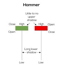
What is the hammer candlestick pattern? When the opening and closing prices are almost the same, it shows that the bulls have taken control of the prices. Since Hammer is a bullish reversal chandelier model, it should form at the end of a downtrend. The long shadow below shows that the bears initially pushed prices too low near the support. But then the bulls came along and eventually pushed the price higher and closed above the opening price. There is a difference between the hammer and the inverted hammer in terms of training. The inverted hammer candlestick is the inverted version of the hammer. What does the hammer candlestick pattern tell you? As seen above, Hammer forms after the stock price falls, indicating that prices are trying to bottom out. The hammers indicate that the bears have lost control of the prices, which suggests a possible reversal of the uptrend. It should be noted that this candle should form after 3 or more bearish candles as it gives more confirmation. Confir...

Candlestick Chart

Image
 The 3 Most Powerful Candlestick Chart Patterns Candlestick charts are a technical tool that groups data from multiple timeframes into individual price bars. This makes them more useful than traditional open-high, low-close bars or simple lines connecting closing price points. Candlesticks form patterns that predict the direction of prices when they end. Proper color coding adds depth to this colorful technical tool, which dates back to 18th-century Japanese rice traders. Steve Nison introduced Japanese candlestick patterns to the Western world in his popular 1991 book, Candlestick Charting Techniques.1 Many traders today can identify dozens of these patterns, which have colorful names like bearish cloud cover, evening star, and bearish cloud cover. three black ravens. Additionally, single bar patterns including Doji and Hammer have been incorporated into dozens of long and short trading strategies. 1. Spinning Top When trading stock markets or other liquid and risky asset classes,...

Balance of Power

Image
Balance of Power (BOP) It is an oscillator that measures the strength of the buying and selling pressure. The Balance of Power indicator is a technical analysis tool. It constantly measures the balance between the market power of buyers and sellers. This helps traders determine the prevailing mood at the moment. Traders can use this indicator to: When the indicator is positive, the bulls are in control; and sellers dominate when the indicator is negative. A reading near the zero line indicates a balance between the two and may indicate a trend reversal. History The Balance of Power (BOP) indicator was developed by Igor Livshin and later presented to the public through Stocks and Commodities magazine in 2001. The BOP measures price trends by measuring the strength of buyers and sellers in the market and determining what prices reach extreme ups and downs. Calculations To calculate the force ratio, use the following formula: Balance of Power = (Close Price - Open Price) / (Hi...

Accumulation Distribution Indicator

Image
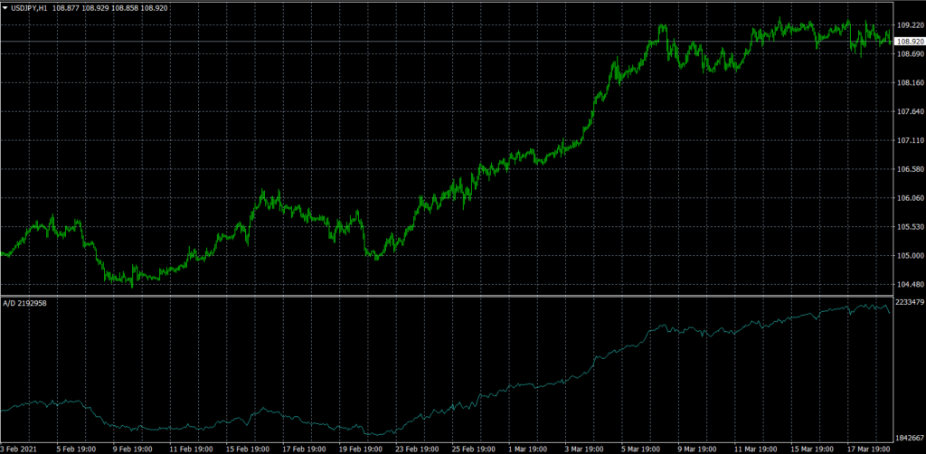
  What Is the Accumulation Distribution Indicator? The A / D metric attempts to identify discrepancies between stock price and volume flow. This gives an indication of the strength of a trend. If the price rises but the indicator falls, it suggests that the volume of purchase or accumulation may not be enough to support the rise and that a fall in price may be imminent. This is how this indicator works 1The actual value of the accumulation distribution is not important. Focus on your direction. 2If the price and the accumulation distribution reach higher highs and lows, the uptrend should continue. 3If the price and the distribution of the accumulation reach lower highs and lows, the downtrend should continue. 4If the accumulation distribution increases in a trading range, accumulation can occur and is a warning of a breakout to the upside. 5If the accumulation distribution falls during a trading range, a distribution can occur and is a warning of a breakout to the downside. The ac...

The Aroon Indicator

Image
 Definition and Use of the Aroon Indicator The Aroon indicator was developed by Tushar Chanda in 1995. Tushar chose this name because the indicators are supposed to reveal the start of a new trend. The Aroon indicator is similar to other momentum oscillators in terms of when the market enters a trend. It becomes more effective in confirming signals or conditions identified by additional technical analysis. Calculation of Aroon Indicators Calculating Aroon metrics is not as complicated as you might think. It simply requires that the high and low prices of an asset be tracked for the number of periods used in the formula. As mentioned above, almost all of the 25 periods of use are recommended by Tushar Chande. Track the ups and downs in the asset price over the last 25 time periods. Note how long it has been since the last high and low. Use these numbers in the Aroon-Up and Aroon-Down formulas below. Aroon-Up = ((25 days from 25-day max) / 25) x 100 Aroon-Down = ((25 days from 25-day...

Harmonious patterns in the currency markets.

Image
  Harmonious patterns in the currency markets. Harmonious price patterns identify the phases of a pullback so that once the pattern completes, you have a clear signal to buy or sell. Retracements are boring at any time, and any help is always welcome, although, with harmonic trajectory patterns, the orthodoxy is to apply for Fibonacci numbers. Again, Fibonacci numbers are not a proven theory and in fact, there is a lot of evidence that Fibonacci numbers only appear as often as chance allows in stock prices, forex included. However, when a perfect or near-perfect Fibonacci number appears, many traders will see it and get the expected result, so Fibonacci-based trading ideas are not worth dismissing. How can these harmonious patterns help you improve your trading strategy? Depending on the reason (each reason can tell a different story), they can be a clue to: Reversal Pattern - Predicts that the price will reverse and move in the opposite direction. Reason for continuation: predicts...

Bollinger Bands

Image